
Brand Identity for Zano Pizza Social Club
in collaboration with Boomerang
Created in collaboration with Boomerang agency, this project builds a distinctive brand from the ground up, starting with the name Zano and evolving into a cohesive identity rooted in culture, ritual, and social connection.
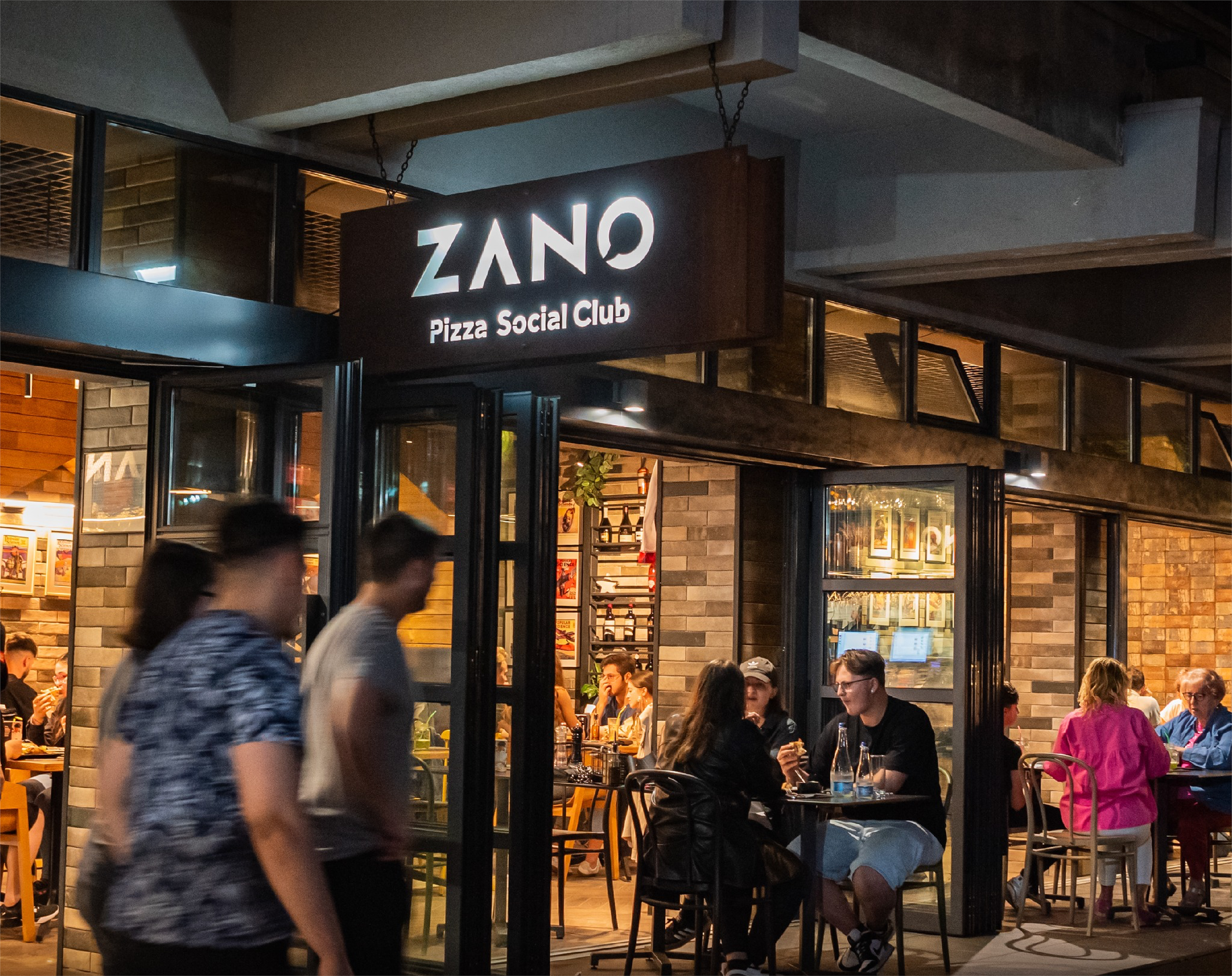
The strategy positions Zano as a contemporary urban “cult”—a place where modern tribes gather to share high-quality, artisanal pizza and meaningful interaction. Inspired by this direction, the visual identity gives the name a symbolic, almost deity-like presence, reinforcing its role as a central meeting point within the city.
The logo is based on a custom-built typeface designed to evoke tribal markings, reinterpreted through a geometric, clean, and contemporary lens. The letterforms create a unique visual rhythm, balancing simplicity with character. Integrated within the logo is a speech bubble symbol, subtly referencing dialogue and the social nature of the space.
The result is a bold and memorable identity that blends primal references with modern aesthetics, positioning Zano as more than a pizzeria—an urban social hub built around craft, community, and shared experience.
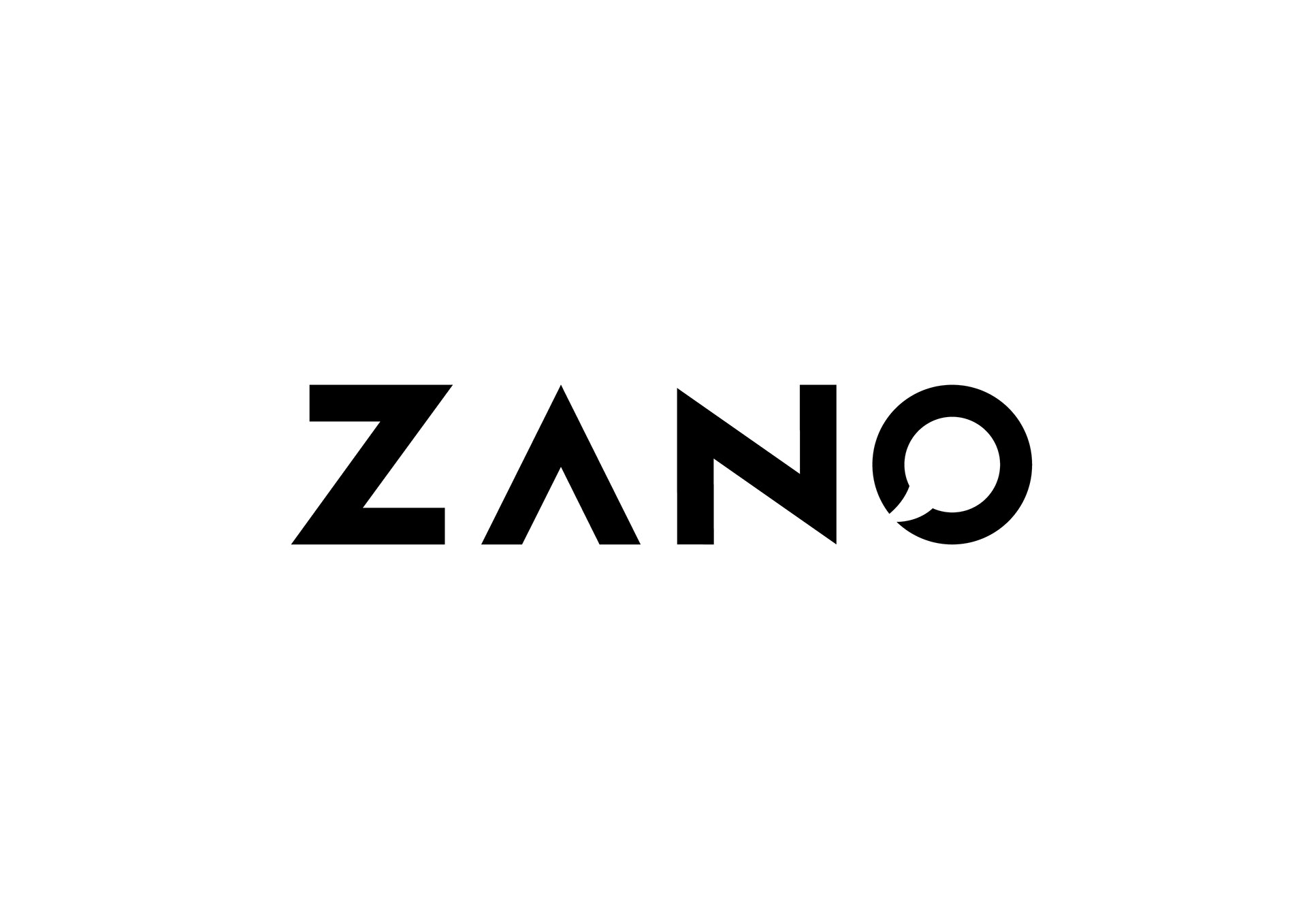
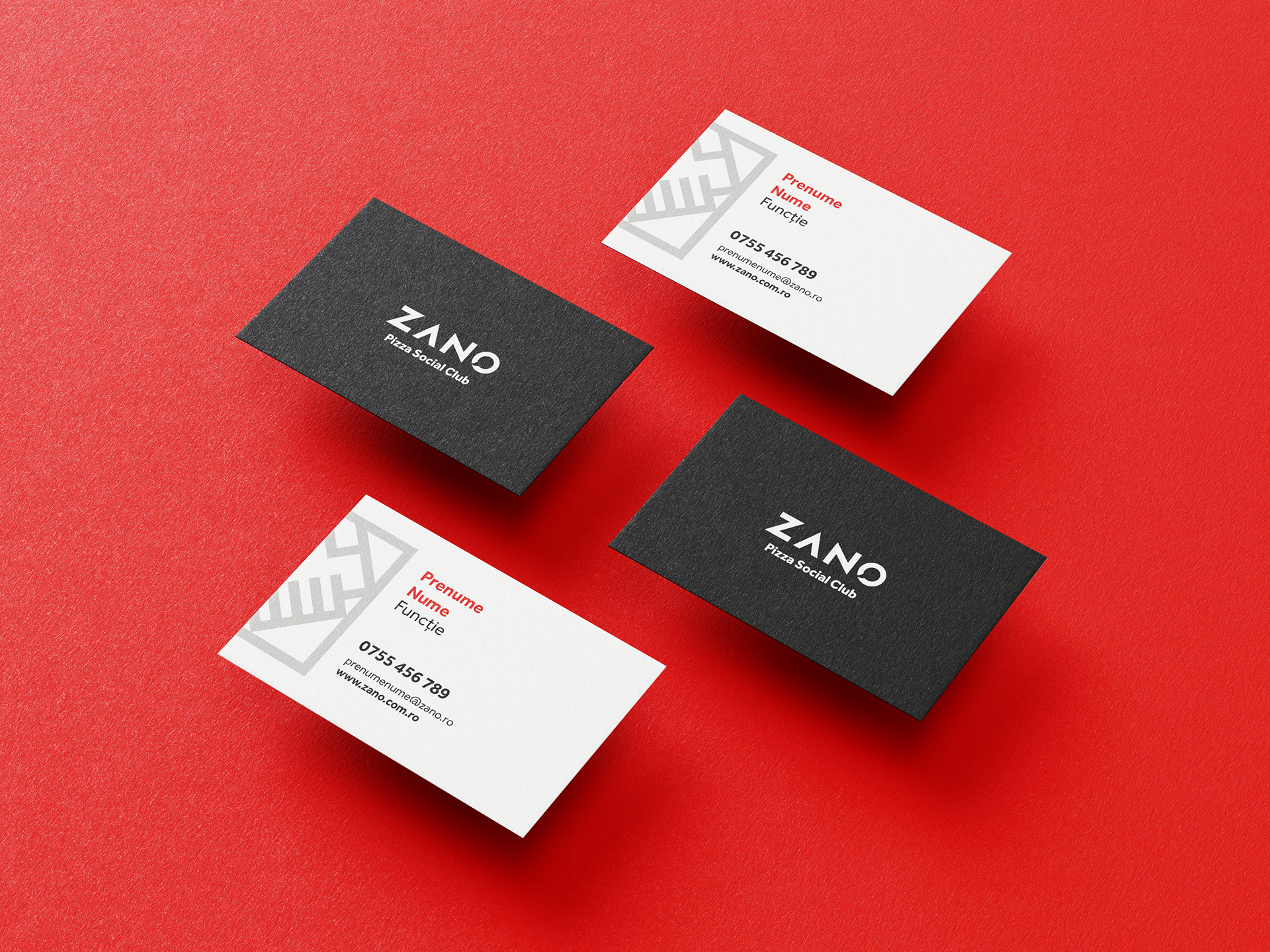
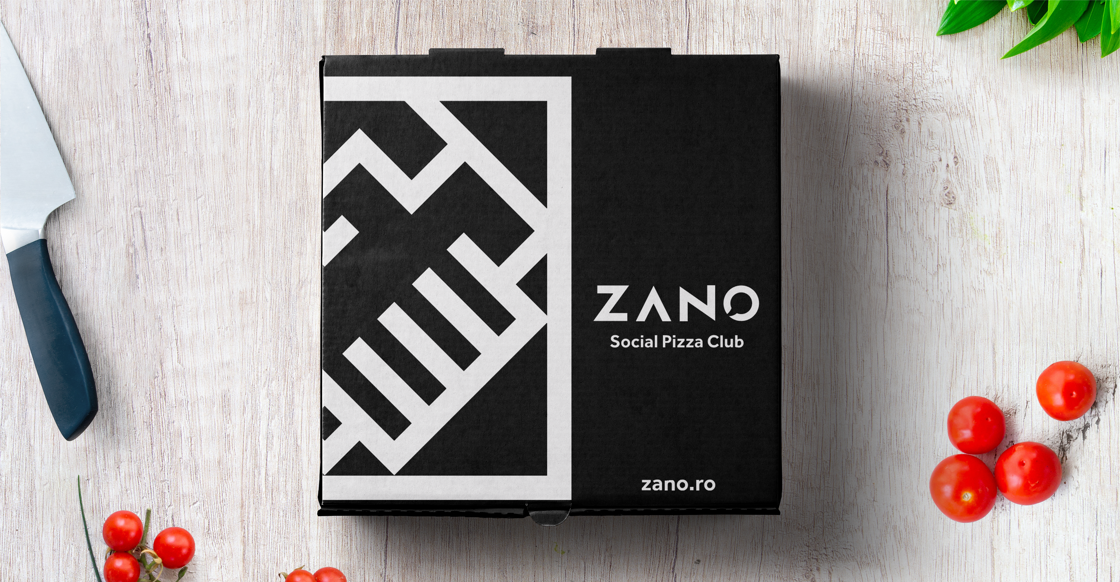
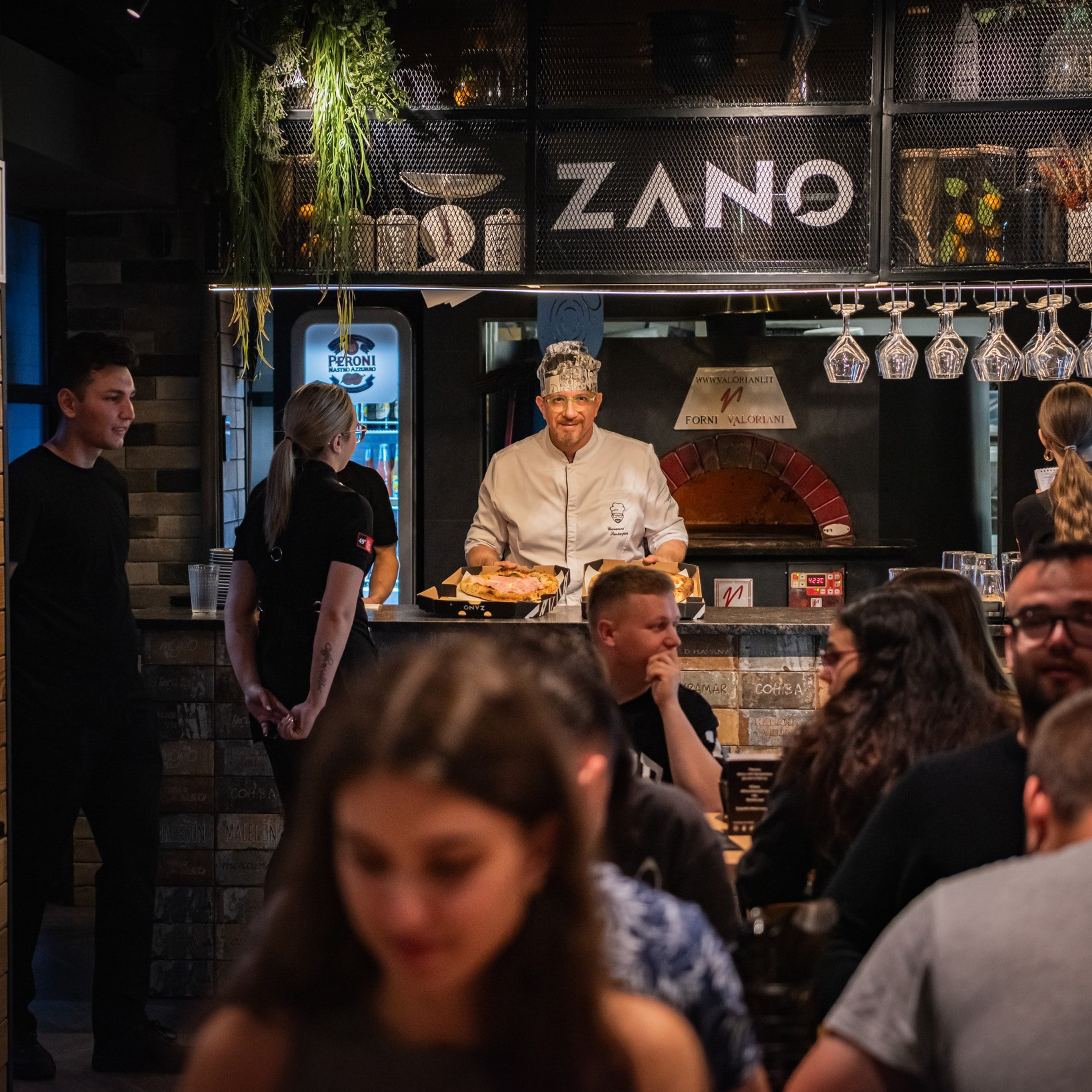
Photo Credit facebook Zano